BikeShare Vis
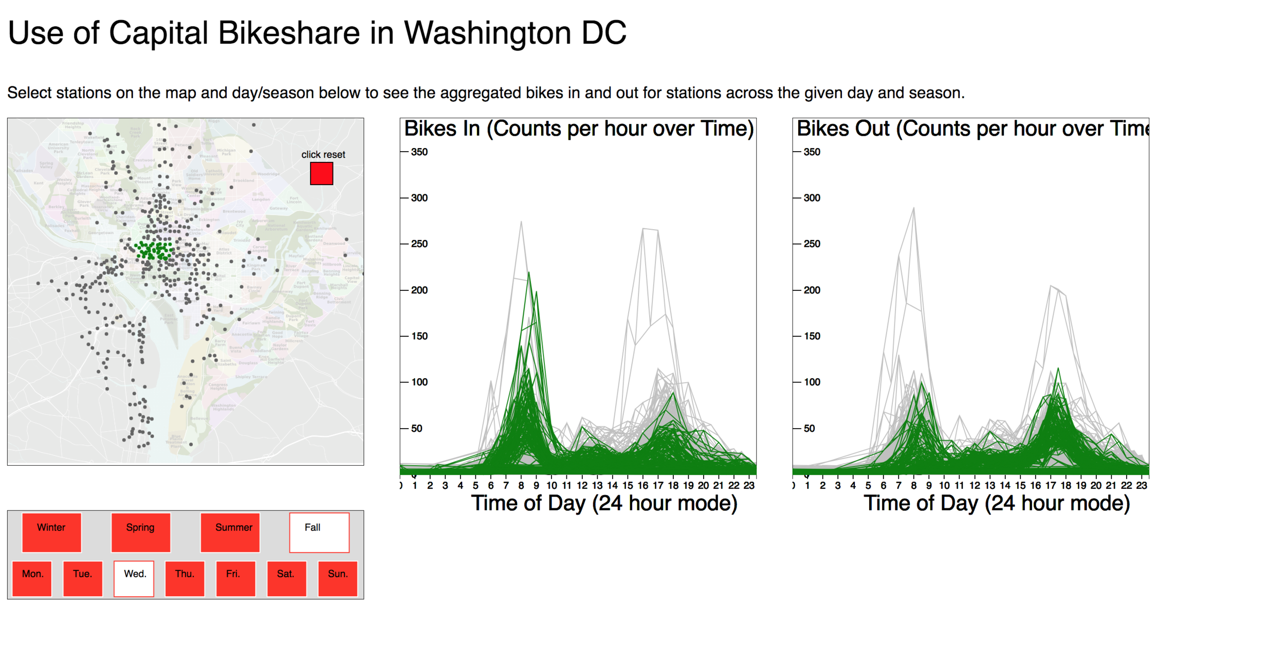
A friend and I were interested in how people use shared-bike services: are they used for commuting, if so what stations are most used? How does season or day of the week impact bike usage? What bike rack stations are underused, and where are they located? etc. With these questions in mind, we made a visualization that explores patterns of bike sharing services in Washington DC, using data from Capital Bikeshare. The left most map shows all the stations where users can take out or store a bike. The two line graphs on the right show the number of bikes taken out or stored for a particular hour in the day. Each line in the graphs represent a specific station. Underneath the map, you can filter the data by season and day of the week. I plan on uploading this interactive visualization into this website soon enough! Meanwhile, here are some photos.


Interactive Vis
Sierra Club ranks colleges on how well they integrate sustainability into their campuses, scoring them on categories such as 'Curriculum' or 'Food and Dining'. How does Carleton College compare to similar sized liberal arts colleges, and what are the areas that Carleton has the most room for improvement? This visualization shows how institutions scored in all the different categories. The categories are ordered by greatest number of points still available for Carleton to achieve to the least number of available points. Data obtained from publically available 2018 Sierra Club 'Cool Schools Rankings.' Red squares above axis convey the number of points Carleton could potentially gain out of total points available. Dark red is for a lot of available points. Light red is for low amount of available points. Number next to axis labels are total points available in that category.
As a sidenote, I need to write about the journey for getting this graph into this website! I encountered my first CORS authentication rejection when trying to get it to work— a big red error: “no ‘Access-Control-Allow-Origin' header is present.” And when I hurdled over, half of the visualization was cut off! My website provider doesn’t provide source code for their templates… so I ended up having to dynamically resize the visualization to match the window size. Also… thank you GitLab for easily hosting files… anyways…Enjoy! Hover over items to explore!